[
BLOG
]


If you are running paid advertising campaigns and sending the traffic to your homepage, you are likely spending more than you need to for each enquiry or sale you generate. The homepage is designed to orient visitors who could be arriving for any number of reasons, with any level of prior knowledge, from any source. It serves a general audience with a general message. A landing page, by contrast, is designed for a specific audience arriving from a specific source with a specific intent, and that specificity is what makes it convert at significantly higher rates than a homepage in most campaign contexts.
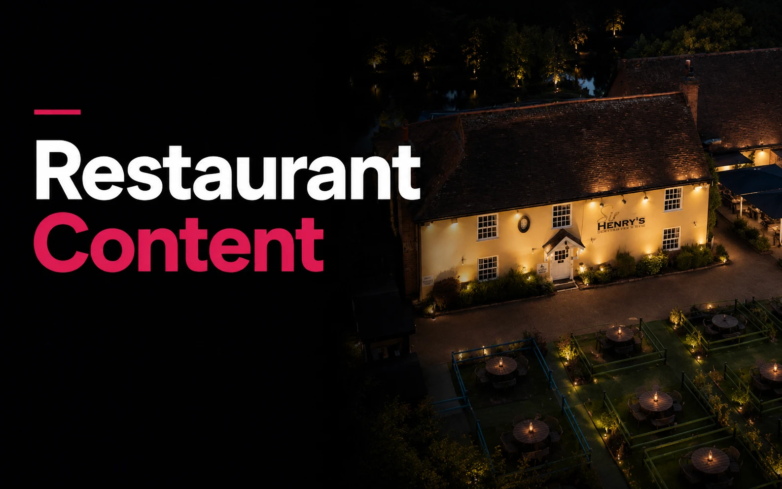
The useful detail here is not decoration. It is whether the page helps the right visitor understand the offer, trust the business and take the next step without friction. That is how we approach our web design service, and it is visible in our work with The Barn at Sir Henry's.
Understanding why this matters starts with thinking about what the visitor experiences when they click your ad. They responded to a specific message: a headline that spoke to a particular pain point, an offer that addressed a specific need, a piece of creative that spoke directly to their situation. They arrive at your page with that message fresh in their mind and a set of expectations about what they will find. When the page they arrive on is generic, those expectations are not met and the visitor's first experience is one of mild disorientation. Many leave immediately. Those who stay are working harder than they should have to in order to find the information they came for.
The Anatomy of a High Converting Landing Page
A landing page built to support a paid campaign has a specific structure that differs from typical website pages. The headline, the very first thing a visitor reads, should echo the message of the ad they clicked. This continuity, sometimes called message match, reassures the visitor that they have arrived in the right place and reduces the impulse to immediately go back. If your ad promised a free consultation for businesses struggling with their accounting, your landing page headline should speak directly to that same audience and that same offer, not to the broader services your firm provides.
Orphaleia Press is a digital first, women's publishing house, a project that needed a website that felt editorial and deliberate, not generic. The design reflected the tone of the publication without getting in the way of the writing.
The primary content section should focus tightly on the specific problem or need that the ad addressed. Not on the full breadth of your services, not on your company history, not on everything you have to offer, but on the one thing this particular visitor is here about. The most effective landing pages are often surprisingly minimal in what they say, because everything that is not directly relevant to the conversion goal is a potential distraction from it.
Social proof should appear near the conversion action rather than in a separate testimonials section. The visitor's doubt is highest at the moment they are deciding whether to submit their details or make a call. A single relevant, specific testimonial placed adjacent to the form or phone number does more to address that doubt than a whole page of reviews that the visitor has scrolled past. The testimonial should ideally come from someone in a similar situation to the visitor: same industry, same problem, same hesitation.
What to Remove Rather Than Add
Counter intuitively, the most common improvement to an underperforming landing page is removing content rather than adding it. Standard website pages include navigation menus, footers with links to other pages, sidebars, and multiple calls to action pointing in different directions. Each of these elements gives the visitor somewhere to go that is not the conversion goal. On a landing page, multiple exit points are a problem. The visitor should have a clear and limited set of options: complete the desired action, or leave.
Many well performing landing pages remove the main navigation entirely, keeping only the logo and perhaps a phone number in the header. This can feel uncomfortable for business owners who are used to thinking about their website as an interconnected system where every page should link to every other page. But the purpose of a campaign landing page is not to invite the visitor to explore the rest of your website. It is to convert a visitor who arrived with a specific intent into a lead or a customer. Removing distractions serves that purpose directly.
The form itself, if you are using one, should ask only for the information you genuinely need to take the next step. Every additional field reduces completion rates. If you only need a name, email and brief description of what the visitor is looking for, that is all the form should ask for. The instinct to collect as much information as possible at the point of contact frequently sacrifices the conversion for the convenience of having pre qualified data, which is a poor trade.
Testing and Improving Over Time
A landing page is not something you build once and leave. The first version is a hypothesis about what will resonate with your target audience and persuade them to act. Some elements of that hypothesis will be correct and some will not be, and the only way to know which is which is to test systematically and measure the results.
Start by establishing a baseline: how many visitors are converting, and what is the cost per conversion? Then change one element at a time, giving each change enough traffic to produce statistically meaningful results before drawing conclusions. Headlines are typically the highest impact element to test, because they are the first thing read and have an outsized effect on whether the visitor continues. Calls to action, social proof placement, form length and page structure are all worth testing once you have a stable baseline on headline performance.
The discipline of continuous testing is what separates businesses that get progressively cheaper leads from paid campaigns over time from those that maintain the same cost per conversion indefinitely. Each successful test compounds with the ones before it, and after six to twelve months of systematic improvement the conversion rate of a well managed landing page is often dramatically better than the original version. That improvement directly reduces your cost per lead or sale, which means the same budget produces more business value or the same volume of leads can be achieved at lower spend.
If you are reviewing your own website, start with our web design service and paid advertising service. Relevant examples include our work with The Barn at Sir Henry's and Heron Country Club.
[
GET INFORMED
]
Our blog is a hub for insights, tips, and industry trends in digital marketing and social media.